KYC Onboarding in Fintech Apps: Verifying Identity Without Losing Users
Fintech onboarding must verify identity and still convert. How to design KYC flows that pass compliance without bleeding signups.
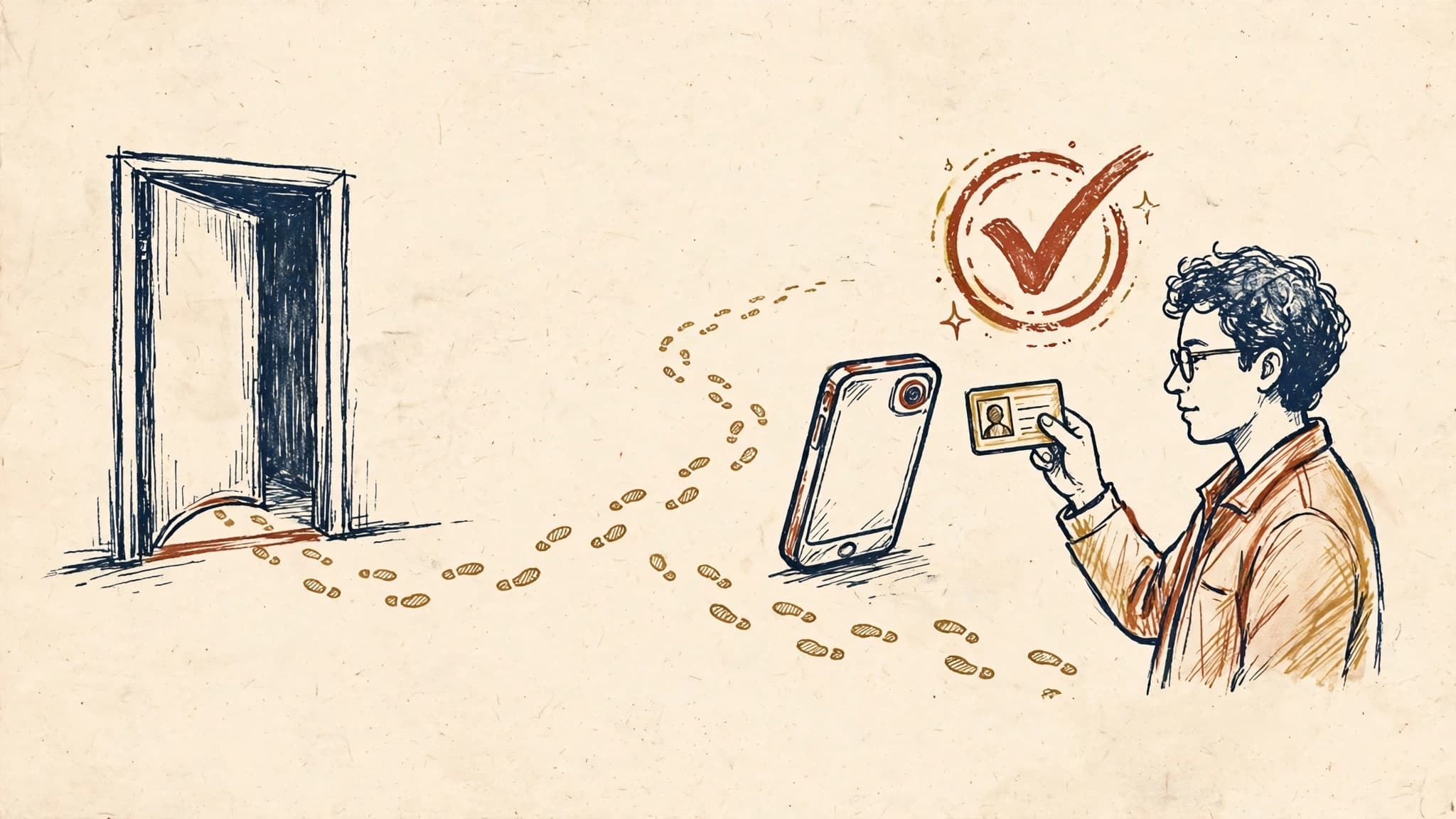
KYC Onboarding in Fintech Apps: Verifying Identity Without Losing Users
Every fintech product has the same uncomfortable moment. A new user has just downloaded your app, they are motivated, they have maybe two minutes of patience — and before they can do anything useful, you have to ask them to photograph their government ID, take a selfie, and wait while a system decides whether they are who they claim to be.
This is Know Your Customer, or KYC. Regulators require it, fraudsters make it necessary, and users hate it. The tension is real: every additional verification step measurably reduces completion, yet skipping verification is not an option. The fintech apps that win this tradeoff do not treat KYC as a compliance checkbox bolted onto the front of the product. They treat it as a funnel problem, designed with the same care as a checkout flow.
This post is about that design problem: where users drop off in KYC, what actually reduces that drop-off, and how to build a verification flow that passes compliance without bleeding signups.
Why KYC Is a Funnel Problem, Not a Form Problem
The instinct inside most fintech teams is to think of KYC as paperwork. A regulator asks for certain fields and documents, so the team builds a form that collects them. The form gets longer with every compliance review. Nobody owns the completion rate.
That framing is the first mistake. KYC is the most expensive funnel in a fintech product, for three reasons.
First, it happens at the moment of peak motivation and minimum trust. The user has not yet experienced any value from your product. They have no reason to believe you will handle their passport photo responsibly, and every reason to be suspicious — they have read the data breach headlines too. Asking for the most sensitive thing a person owns, before delivering anything, is the hardest ask your product will ever make.
Second, KYC failures are silent. When a user abandons a shopping cart, you can retarget them. When a user abandons KYC, they usually just disappear. They do not email support to say the selfie capture failed three times. They delete the app and try a competitor whose flow felt easier. The drop-off is invisible unless you instrument every step.
Third, KYC has two kinds of failure, and teams usually only measure one. There is user abandonment — people who quit mid-flow. And there is verification failure — people who complete the flow but get rejected, flagged for manual review, or stuck in a pending state for days. Both cost you a customer. The second one is worse, because it costs you a customer who already did the work.
The teams that get this right start by measuring the funnel the way a growth team measures signup: completion rate per step, time per step, retry rate per step, rejection rate, and manual-review queue time. Without those numbers, every KYC discussion is vibes.
The Drop-Off Curve: Where Users Actually Quit
KYC flows typically have four stages, and the drop-off is not evenly distributed.
Stage 1: Document selection and capture. The user picks an ID type and photographs it. This is where the largest single chunk of abandonment happens. The reasons are mundane: glare on the card, a blurry photo, a capture screen that gives no guidance, or a user who simply does not have their ID nearby. A surprising number of people start fintech onboarding on the couch at 11pm, without their wallet in reach. If your flow demands the document immediately, with no way to pause and resume, you lose them.
Stage 2: Selfie and liveness. The user takes a selfie, often with a liveness check — blink, turn your head, follow the dot. This stage has the highest retry rate. Front cameras in poor light, older devices, and users wearing glasses or head coverings all create failures that feel personal. A liveness check that fails twice without explaining why reads to the user as "this app thinks I am a fraudster," and they leave angry.
Stage 3: The wait. The user submits and waits for a verdict. Automated checks return in seconds; manual review can take hours or days. This is where the second abandonment wave hits. A user who submitted at 11pm and hears nothing by morning has usually moved on. A pending state with no explanation and no timeline is functionally a rejection.
Stage 4: The edge cases. Address proof, source-of-funds questions, business documents for merchant accounts. These affect a minority of users but produce the longest support threads and the worst reviews, because the users who reach them are your most motivated ones — people trying to move real money.
The product implication is straightforward: do not optimize the flow as a whole. Optimize stage by stage, because each stage loses users for different reasons and each needs a different fix.
Design Decisions That Actually Move Completion
Let users pause and resume
The single highest-leverage change most fintech apps can make is also the simplest: let people leave and come back. Save progress at every step, send a reminder that respects the user's context ("Your verification is 2 steps from done"), and deep-link them back to exactly where they stopped.
This matters because KYC is frequently interrupted by real life — the ID is in another room, the lighting is bad, the bus arrived. A flow that treats interruption as abandonment converts interruption into churn. A flow that treats it as a pause converts it into a return visit.
The compliance objection here is usually unfounded. Storing a half-completed application with a partially captured document is standard practice; your KYC vendor almost certainly supports session persistence. What it costs is engineering time on state management, which is exactly the kind of unglamorous work that moves the metric.
Give the camera a coach, not just a frame
Most document capture screens show an outline of a card and hope for the best. The better ones coach in real time: detect glare and say so, detect blur before submission rather than after, auto-capture when the document is steady and legible instead of making the user press a button at the wrong moment.
The difference in completion between a passive frame and an actively coaching capture screen is large, and the reason is psychological. A user who submits a bad photo and gets a generic "verification failed" message blames your product. A user who is told "move away from the window, there's glare on your card" before they submit feels helped. Same camera, same document, completely different experience.
The same principle applies to selfies. Tell users what will happen before it happens: "We'll ask you to turn your head slowly — this takes about 10 seconds." Explain failures specifically: "We couldn't see your face clearly — try facing a window." Vague errors are the enemy of completion.
Sequence the ask: value before verification
Not every fintech product needs full KYC before the first useful moment. The best flows sequence verification against value.
A payments app can let users browse, set up a profile, and even receive money before requiring full identity verification, gating only the actions regulators actually require it for — typically sending money out or crossing a transaction threshold. A trading app can let users explore markets and build a watchlist before asking for documents. An investing app can explain its portfolio approach before demanding a passport photo.
This is progressive verification, and it works for the same reason progressive permission requests work: a user who has already experienced value will tolerate friction that a cold user will not. The compliance team needs to be in this conversation early, because the sequencing has to map to real regulatory thresholds — what you can legally offer unverified varies by jurisdiction and product. But "we must verify everyone upfront" is rarely the actual regulatory requirement. It is usually the simplest engineering choice, and simplicity for the team is being paid for with user drop-off.
Design the pending state like a product surface
When verification goes to manual review, most apps show a spinner and a sentence. Then silence. Days later, maybe an email.
The pending state is a product surface, and it deserves product design. Tell users what is happening in plain language, not compliance jargon: "A person is reviewing your documents — this usually takes under 4 hours." Give a real timeline, and honor it. Provide a channel for questions that does not require the user to dig through a help center. And critically, let users do something useful while they wait — explore the app, set preferences, read educational content, invite a friend. A waiting user with nothing to do is a user reconsidering whether they need your product at all.
Manual review queues also deserve a service-level target, owned by product, not just operations. If your median review time creeps from 2 hours to 2 days, your activation rate will fall and nobody will connect the two unless someone is watching both numbers.
Build fallbacks for the users your automation rejects
Automated verification fails disproportionately on certain users: people with older or damaged documents, people whose appearance has changed since their ID photo, people in countries whose ID formats your vendor handles poorly, people with names that transliterate inconsistently across documents.
A flow with no graceful fallback turns these users into permanent rejections. The fix is a manual-review path that is easy to reach and genuinely staffed, plus alternative verification methods where regulation allows — a bank transfer from an account in the user's name, for example, is accepted as a verification signal in several jurisdictions.
There is a business case here beyond fairness. The users who fight through a difficult verification are often your highest-intent users. The cost of a manual review is small compared to the lifetime value of a customer who already proved they want your product badly enough to argue with your camera screen.
The Metrics That Tell You Whether It's Working
A KYC funnel worth managing tracks a small set of numbers, reviewed weekly by both product and compliance:
- Step completion rate. The percentage of users who start each step and finish it. A step below 80 percent is a design problem, not a user problem.
- First-attempt capture success. How often the first document photo and first selfie pass quality checks. Below 70 percent, your capture UX needs work.
- Auto-approval rate. The percentage of submissions approved without human touch. A falling auto-approval rate usually means a vendor model change or a document-format shift, and it directly inflates your review queue.
- Time to decision. Median and 95th percentile, from submission to verdict. This is the number your pending-state copy promises, so it had better be true.
- Resubmission-to-approval rate. Of users who fail once and try again, how many eventually pass? A low number means your error messages are not teaching users how to succeed.
- Verification-to-first-transaction rate. The ultimate metric. A user who passes KYC but never transacts was not really onboarded — something after verification is still broken.
Watch these numbers segmented by device, country, and document type. KYC performance varies wildly across those dimensions, and an aggregate number will hide a broken experience for a whole segment. If your Android completion rate is 15 points below iOS, that is not a mystery to accept — it is usually a camera or SDK issue with a fix.
The Compliance Conversation, Reframed
The hardest part of KYC design is rarely technical. It is organizational: product wants fewer steps, compliance wants more evidence, and both sides are optimizing for something real.
The reframing that works is to put both sides on the same metric. Compliance does not actually want more steps — it wants fewer fraud losses, fewer regulatory findings, and an audit trail it can defend. Product does not actually want fewer steps — it wants more activated users. A flow that auto-approves good users in seconds, routes genuinely risky cases to review, and converts more legitimate users is better for both sides than a flow that is merely long.
Three practices make this collaboration work. First, bring compliance into funnel reviews, with the numbers, not just into launch approvals. Second, run verification changes as experiments where regulation allows — A/B test capture UX, sequencing, and copy, and share the results with compliance so the next conversation starts from evidence. Third, document the reasoning behind each step: what risk it mitigates, what regulation requires it, what the drop-off cost is. Steps that survive this exercise are defensible. Steps that do not are usually legacy caution, and legacy caution is the most expensive line item in a KYC funnel.
Takeaways
KYC is not a form. It is the most consequential funnel in a fintech product, and it should be designed, measured, and iterated like one.
- Instrument every step before redesigning anything. You cannot fix a funnel you cannot see.
- Let users pause and resume. Interruption is not abandonment unless your product makes it so.
- Coach the camera in real time. Specific, in-the-moment guidance beats generic error messages after the fact.
- Sequence verification against value. Ask for the most sensitive thing only after the user has a reason to trust you.
- Design the pending state. A waiting user with a timeline and something to do is a user who stays.
- Build real fallbacks for the users automation rejects. They are often your highest-intent customers.
- Manage KYC on shared metrics with compliance, not in a tug-of-war between conversion and caution.
The fintech apps users recommend are not the ones with the least verification. They are the ones where verification felt like a brief, respectful, well-explained step on the way to something the user wanted — not a wall they had to climb before they were allowed to care.